

Conquering “The Wall”

We have all contemplated it in one home or another – What to do with that vast over-your-couch wall space? I call it The Wall… that one giant expanse, usually located over the couch in a family room (but I’ve also seen them in dining rooms and hallways). These are long spaces that glare back at you intimidatingly. The thought echoes in your mind – how am I ever going to fill this space?? Two words: GALLERY WALL.
I recently tackled The Wall in my home. You may have seen some of the “after” images in my Instagram feed and I’m finally ready to break it all down in a blog post. When we first moved into our apartment, I was definitely feeling a bit overwhelmed. We moved from a 2,300 square foot suburban home in Florida into our new, tinier (but closer to the city) space. That meant a serious re-plan was needed when it came to deciding where and how the artwork should be displayed.
Identifying the Problem Area
In our apartment, The Wall is 188 inches long – over 15 feet of blank canvas. We are renters here, so this particular wall is also a giant, very tan, blank canvas. Now, don’t get me wrong, tan can be fantastic and there is no denying the power of a well-placed neutral. Tan is actually a great backdrop for displaying artwork. But I hate living in a wall-to-wall tan box. I need color in my life – vibrant, energizing color. I need to feel inspired for my day and the all tan box might be the least inspiring interior on the planet. Time to have a serious “Make it work” moment (thanks Tim Gunn) because I do not feel like painting just to repaint it back to tan later. Gallery Wall to the rescue!

Initially, right after we moved in, I hung three pieces in a row, centered perfectly over the couch. The imagery all referenced New York City in some way, a place I love and where I lived for two years. Each piece is meaningful to me, but the grouping always felt a bit like a place holder in this particular space. Not quite what I had envisioned in the new apartment somehow. After about a year, I was ready for a REFRESH. The frames felt heavy and with the approach of spring, I wanted LIGHT and BRIGHT and AIRY.
Getting Started by Clearing the Space

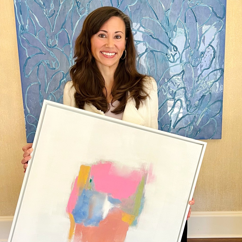
First things first: taking down the existing artwork. It was time to confront The Wall in all its glory. Sometimes you have to clear the space in order to see the vision. Next up, I moved my colorful landscape by artist Wendy McArthur, so that it could be the central focal point over the couch. It had been hanging in our dining room, where it had a perfect space and looked great. But it was also out of view from most of the apartment. In its new place over the couch, I can see it from the dining room, the kitchen, the hallway, and of course, the family room, where we spend most of our time.
I was already happy with this one change, but I also knew that this wall could handle a lot more visually. This would be the ideal spot for a gallery wall display. Two of our other pieces instantly came to mind. One is a beautiful Richard Misrach fine art photograph from his Cloud Series and the other is a pink sparkly abstract that my toddler painted at school. Both pieces make me smile and I wanted to display them where I could see and enjoy them on a daily basis.


Frame Collections Are Your Friend
I knew the colors in these pieces would work well together, but the framing situation required attention. The Misrach came in a frame that I didn’t love and my son’s piece had been floating around from room to room completely unprotected while I was trying to figure out its forever home. I wanted this to be a quick and affordable spring refresh, so I went in search of readymade frames at a nearby Michaels store. I like that they have frame collections that offer options in most standard sizes with similar finishes and feels. The bottom line: no guesswork… you know these frames will look good together. I am a big fan of the Alexandria Frames. I picked out two from this collection and got right to work updating my artwork at home.

With perfect timing, my son brought home one more sparkly abstract from school. This one was made with glue and jewel tone glitter (it’s like he can read my mind). This artwork differs from the painted pink abstract in size and form (keeping it from feeling redundant in this space) and the composition would lend visual interest to the grouping. Plus, did I mention jewel tones and glitter??
Use Pinterest to Round Out Your Gallery Display
The last two pieces came from Pinterest! There are so many amazing and free digital art downloads out there that are easy to search for on Pinterest. I was thinking something with wording, but I wasn’t quite sure what would work. Then, I came across this “Shine Bright” art print from the blogger and artist behind the website www.foxandhazel.com. It was one of a group of three Geometric Minimalist Art Prints that showcase a clean, elegant design. The straight-edged shapes would be the perfect complement to the more free-form compositions in the grouping. Additionally, the soft pink of the “Shine Bright” art print would balance the shimmery pink of my son’s artwork. And did I mentioned that these digital downloads are FREE?!

My trick for making a digitally downloaded art print look awesome is to print them on high quality glossy photo paper (I used HP Premium Plus Photo Paper). Add a sophisticated frame and no one will guess that this is a DIY digital download! Quick trip back to Michaels and the Alexandria Collection (seriously, thank goodness there is a Michaels down the street from where I live). I placed the purple marbled geometric art print in a gorgeous high-end Larson-Juhl frame that I already owned. The frame has a slightly different feel from the others, but I love how the dark gray tones balanced the gray-blues of the Misrach sky.
The Bottom Line
When designing a gallery wall, I am looking for visual harmony through the balance of composition and color. Sometimes you have to play around with the pieces for a bit until you find their perfect placement. I have a wonderful hubby who will hold artwork up for me to scrutinize for inordinate amounts of time. Artwork relates to each other on the wall and some pieces may play nicer together than others. Creating a gallery wall can be a bit like doing a puzzle without referencing the picture on the front of the box. Sometimes you have to test the spacing until you find the right fit.
I am so thrilled with the end result! My goal was to keep this refresh affordable by mixing fine art pieces that I already owned with artwork that my son created and free digital art prints available on-line. New, readymade framing gave the gallery wall a cohesive look while keeping my budget in check. The Wall has been tackled and feels ready for spring!

5 Comments